Well. This was a new thing for me. I was contacted by a company called Sleeklens to do an honest review/blog post on their Photoshop actions. You can view or purchase them here: https://sleeklens.com/product/landscape-adventure-photoshop-actions/
So. I feel strange about sponsored content--I grew up in the '90s where product placement was oft-maligned (most notably in my mind by Wayne's World II) but then totally embraced, but in a winking sort of way (see also: Wayne's World II). This blog does not aim to wink. I wanted to try the thing, so I did, and here we are. Let's jump in, shall we?
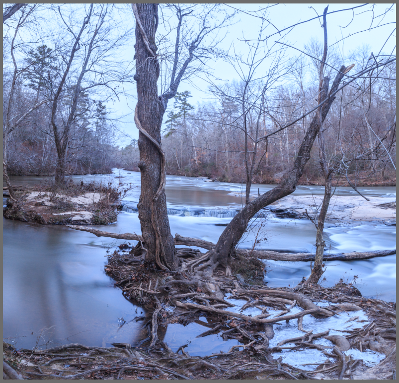
Here's a screenshot of the image with minor Lightroom adjustments & stitching (two image pano):
First, I tried their action called "Good Place To Start" which...was!
It sort of flattens everything out and lends itself easily to contrast adjustments later. This is generally the look of my images when I bring them into Photoshop--flat with good detail in the shadows & highlights. Highlights are just a tad bright, but that's possibly OK.
Next, I tried the Reduce Highlights action, which worked well. Then I added the Brighten Shadows action...and added a Ronnie James Dio-inspired moon, because I wish this existed in real life:
The "moon" is actually just a layer mask, painted in. I really like that with these actions in Photoshop, you can put masks on things, reduce or increase opacity, etc. They're not set in stone and they function pretty well. Here are some example photos:
Frosty, 100% opacity
Frosty, reduced opacity. Really like this version. It was so cold. Looking at this makes me cold.
Frosty + Dark and Stormy. Also a favorite cocktail.
Soft Golden Hour Action.
I had to push some elves out of the way for this photo
Punchy B&W. Really, really like this one.
You can remove the Gaussian Blur from this action. Which is probably what I would do. You can also reduce opacity or paint on layer masks. Nice.
Now here's what I don't like. I don't like that you have to complete the actions off of your base layer. I had it drilled in my head in photo school to always work on a copy of your background layer and that's *always* what I do, just in case. I realize now, with the way Photoshop & Lightroom CC store sidecar files and with the way layers work, it's not always necessary, but, man...try to get Ms. Mounger's voice out of my head. I dare ya.
Also, the actions don't play very well together. There's a bit of confusion when combining them and typically you have to start from the base layer. Also, messing with layer order is necessary because some actions obscure others depending on order.
Some additional edits that I liked:
Deep Cinematic: Reduced Opacity. This is closest to my own editing of the original photo.
Again, subtle. Opacities adjusted all over the place.
Warning Dialogue. I like this, but you also can't turn it off.
Overall, these are very well made with much attention to detail and they don't go overboard with the effects. I really love the Black and White actions--that's an area in which I struggle. I'm a conservative editor because I like things to look good in-camera and to not stretch credulity too much. Plus, I think this oversaturated photography bonanza you see everywhere is just another symptom of people's short attention spans. A sin of which I am also guilty here and there. Anyway. I most likely wouldn't have purchased these actions on my own (for myriad reasons, stubbornness being chief among those), but to have a comparison tool, these are pretty neat. Also, the black and white options are a high selling point to me.
I probably do things the hard way, but I like maximum control over my images and rarely use actions. It would probably save me a lot of time and these have definitely made me think about my workflow. My biggest takeaway is that these actions are great for editing comparisons and great to spark new ideas if one feels stuck.
Some links: https://www.pinterest.com/sleeklens/lightroom-presets/
https://sleeklens.com/product-category/photoshop-actions/


